
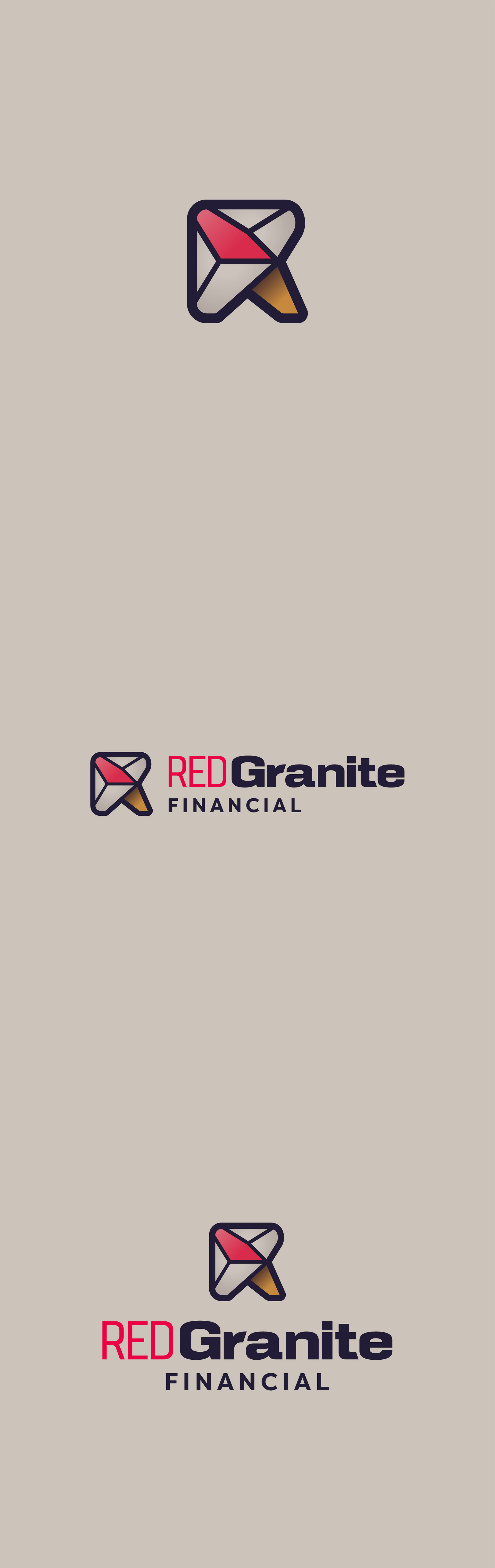
Red Granite Financial sought a visual identity that embodied strength, trust, and a connection to their Wisconsin roots. Drawing inspiration from Balanced Rock, a striking geological formation at Devils Lake State Park in Baraboo, WI. I crafted a series of logo concepts that reflect the stability and character of exotic granite—a stone known for its durability, unique texture, and rare movement.
Each concept embodies a different aspect of the company’s foundation, from balance and resilience to precision and confidence. Through these concepts, I explored the dynamic relationship between nature, balance, and financial security. Each direction tells a story of resilience and trust, seamlessly connecting Red Granite Financial to its namesake and the enduring qualities of granite.
Concept Explorations
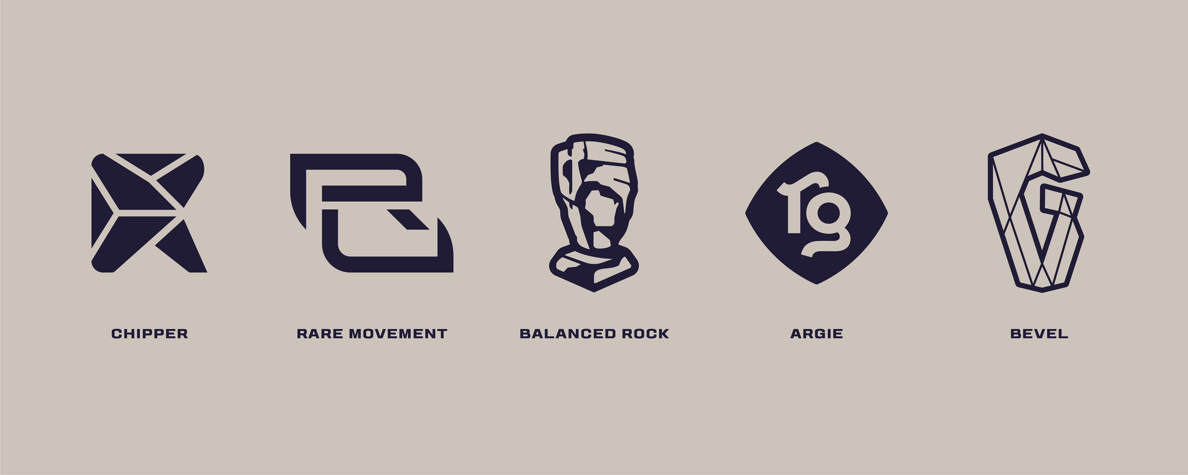
Chipper
An abstract symbol that captures the fragmented yet cohesive beauty of chipped granite, forming a stylized “R” letterform. This concept highlights uniqueness at the granular level, much like financial strategies tailored to individual clients.
Rare Movement
An abstract interpretation of exotic granite’s unpredictable texture and movement. Incorporate interlocking letterforms of “R” and “G” with sharp curves and a bold presentation, symbolizing the dynamic yet dependable nature of financial growth.
Balanced Rock
A representation of financial stability and strength, drawing direct inspiration from the delicate balance and natural formation of the iconic Balanced Rock landmark. The visual approach evokes trust, precision, and resilience.
Argie
A modern, monogram-style representation with sophisticated curves and a subtle, playful confidence. The design features a slightly bloated frame to create an inviting and eye-catching visual, emphasizing approachability while maintaining a high-end feel.
Bevel
A nod to the smooth yet structurally sound characteristics of premier granite. Featuring beveled edges, subtle depth, and balance in its form, reflecting the precision and craftsmanship of the company’s approach to financial services.
Identity refinement
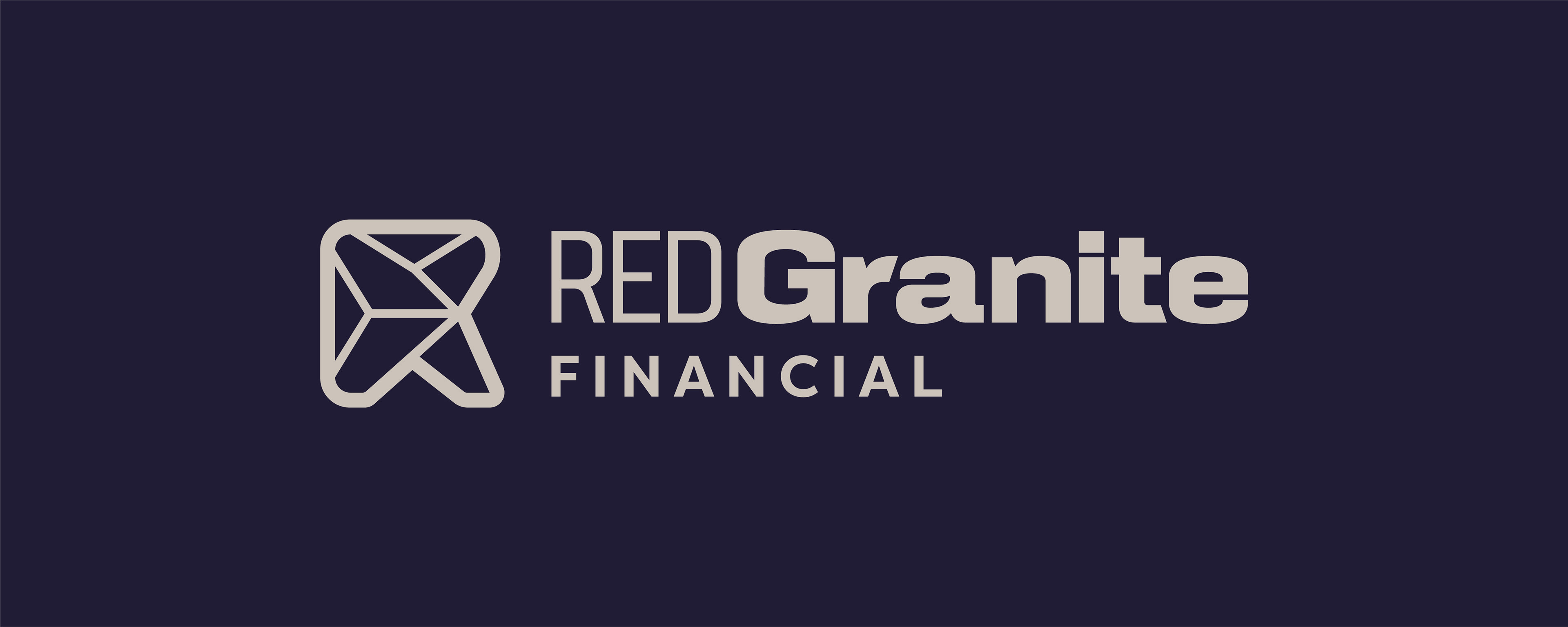
The logo identity is a fusion of natural geological strength and modern financial reliability. The icon represents the unique characteristics of granite, with its sharp curves and bold presentation mirroring the rare, unpredictable movement found in exotic granite chips. Inner shapes symbolize the way light interacts with mineral flakes, while the abstract "R" letterform reflects the live edge of a granite stone, reinforcing the company’s dynamic yet enduring foundation.
Word Mark
The word mark is crafted using Karnchang Extended Bold and Karnchang Condensed to create a presence of foundational weight and structure. The bold type features distinctive flourishes contrasted by sophisticated edges, while the condensed variant adds vertical balance, allowing for a splash of red without overpowering the icon. Filson Pro complements the design with a modern geometric aesthetic and high readability, reinforcing a clean, professional, and forward-thinking brand image.
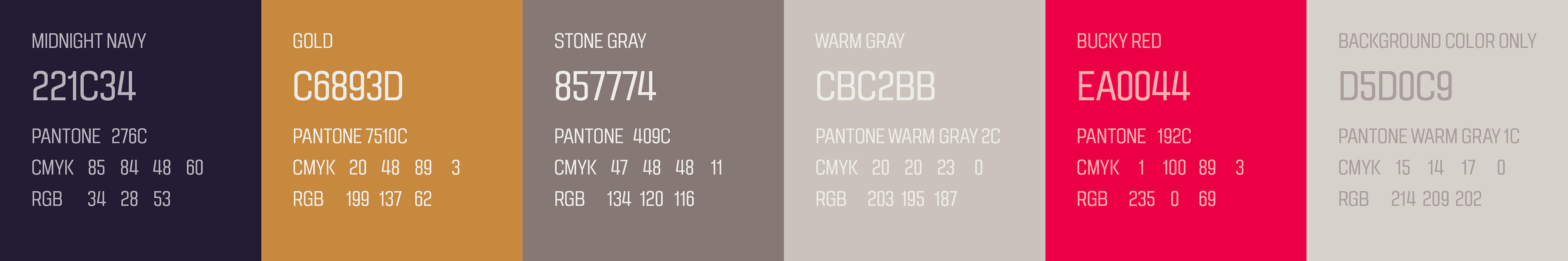
color palette
The color palette draws from the bold hues of warm red and purple granite stones, reflecting the Red Granite Financials down to earth approach while maintaining an inviting and refined aesthetic.
Check out how I further developed Red Granite Financial's identity into a cohesive brand.

Hat
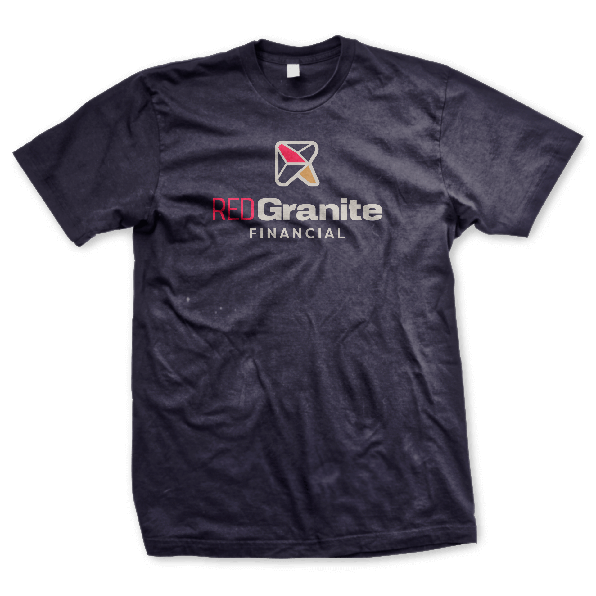
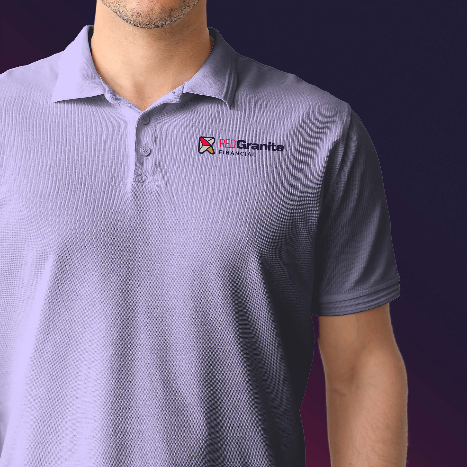
T-Shirt
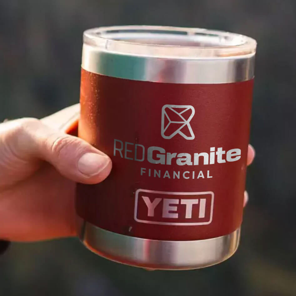
Promotional Items