
A Sweet Identity Refresh
overview
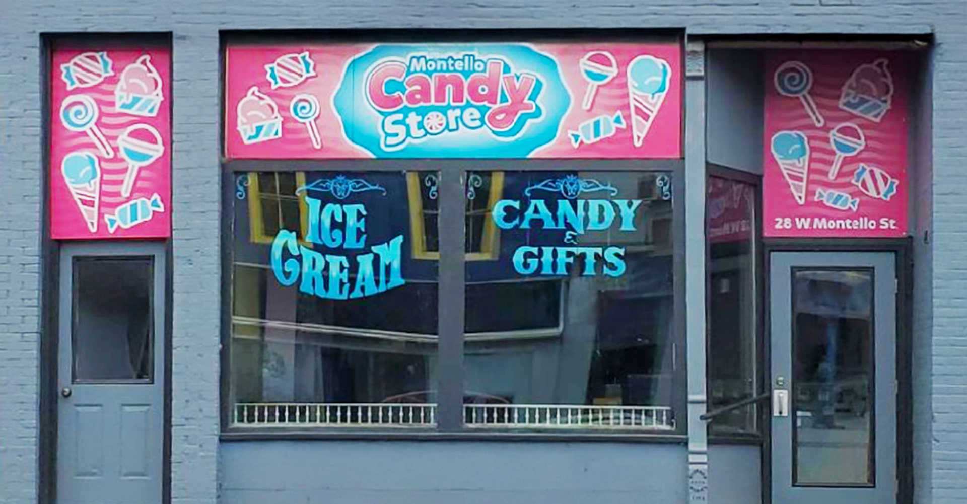
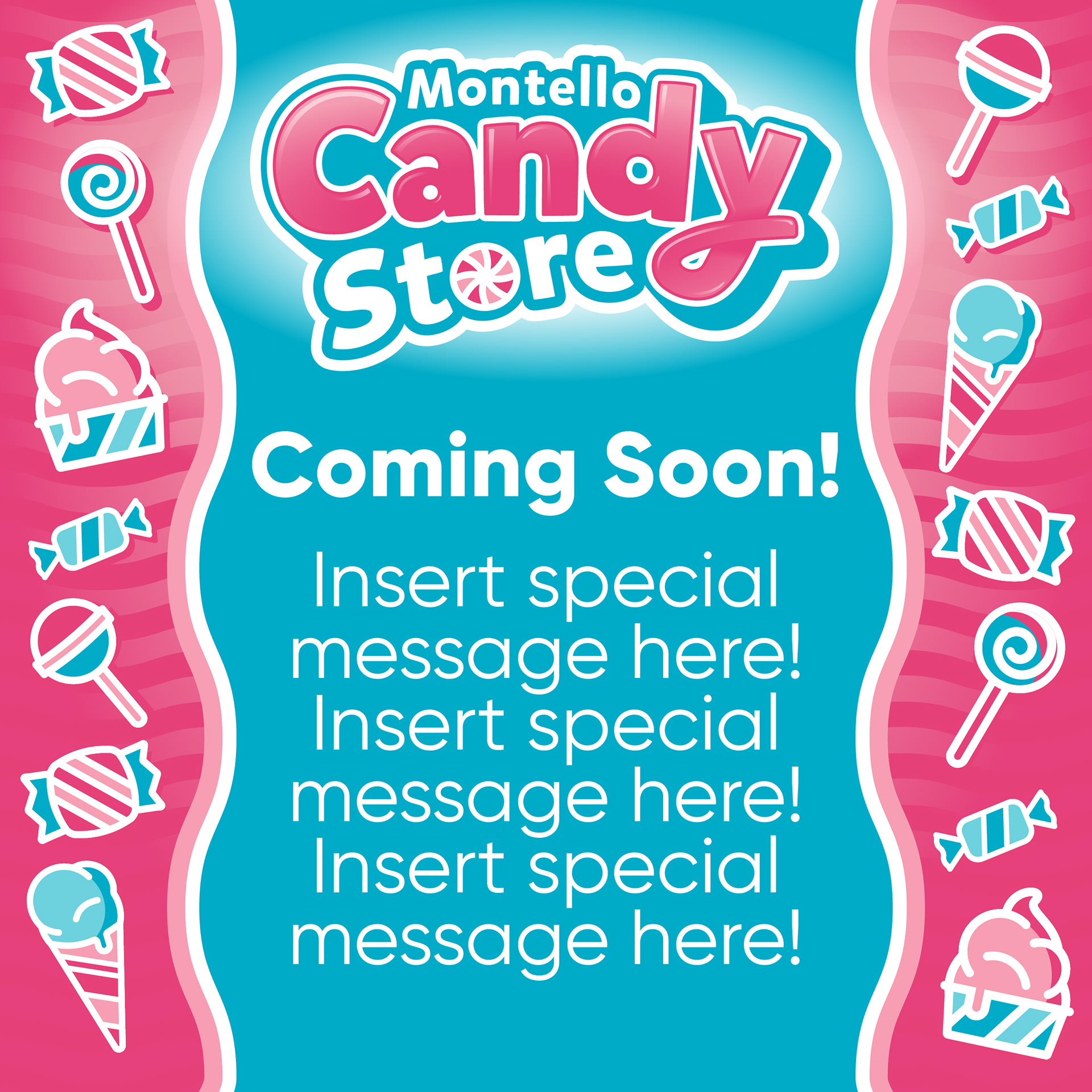
A historic candy store in downtown Montello, WI, recently changed ownership and was ready for a fresh new look. While the location benefits from steady tourism traffic, its previous branding was subtle and lacked the visual impact needed to attract new customers. Locals affectionately refer to the shop as “The Candy Store,” so the goal was to create a vibrant, eye-catching identity that retained its heritage while embracing playful, modern design.
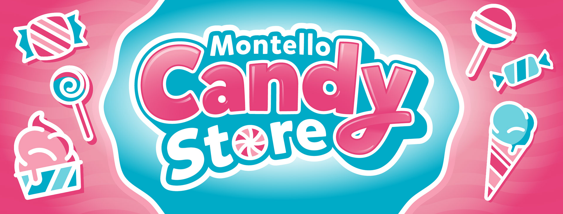
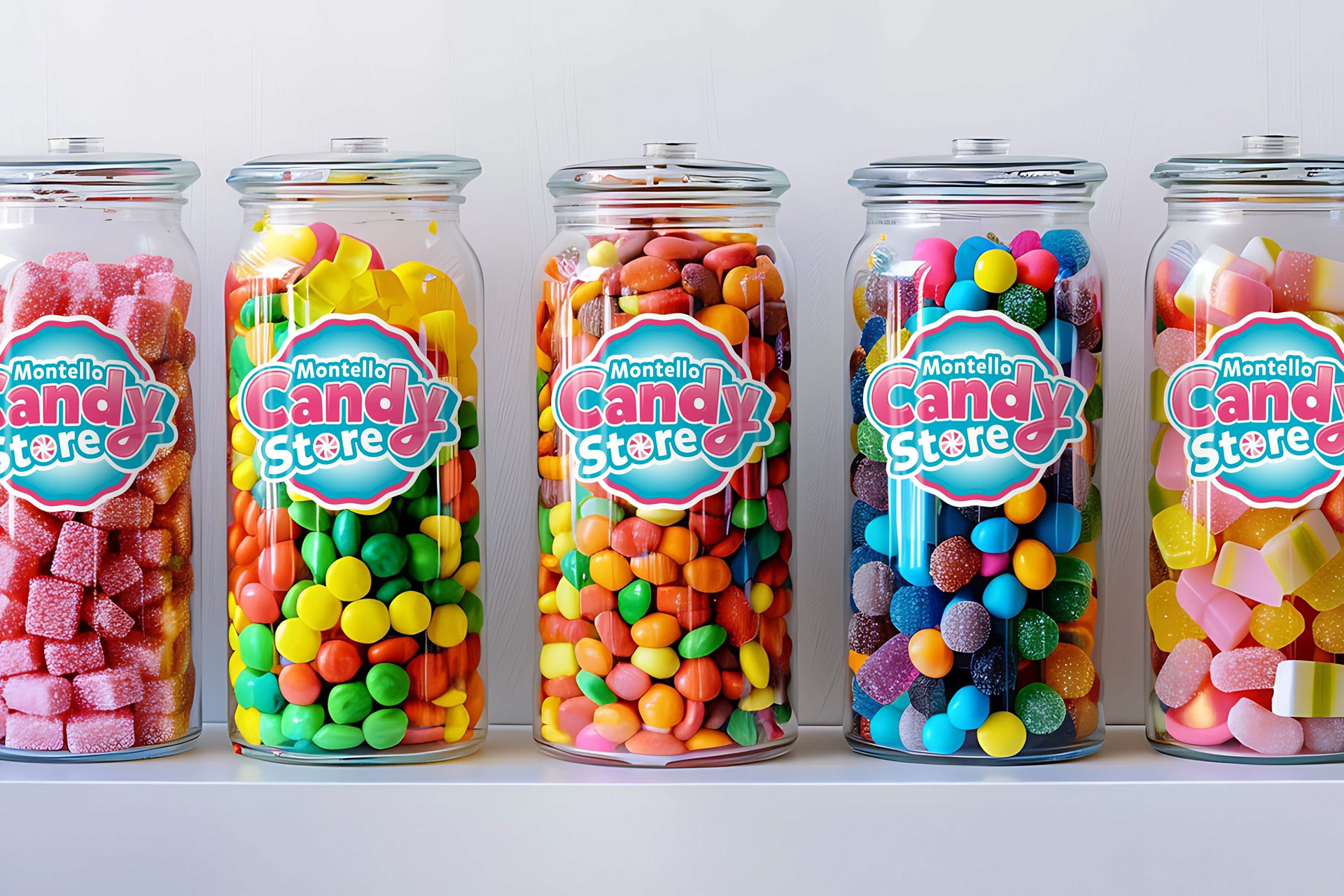
The new branding needed to be bold, colorful, and instantly recognizable, ensuring that passersby—whether local or tourist—would take a second look. The solution? A versatile, high-impact logo where the word Candy takes center stage, making it easy to read and immediately evocative of the store’s sweet offerings.
The new branding needed to be bold, colorful, and instantly recognizable, ensuring that passersby—whether local or tourist—would take a second look. The solution? A versatile, high-impact logo where the word Candy takes center stage, making it easy to read and immediately evocative of the store’s sweet offerings.
Concept Sketches
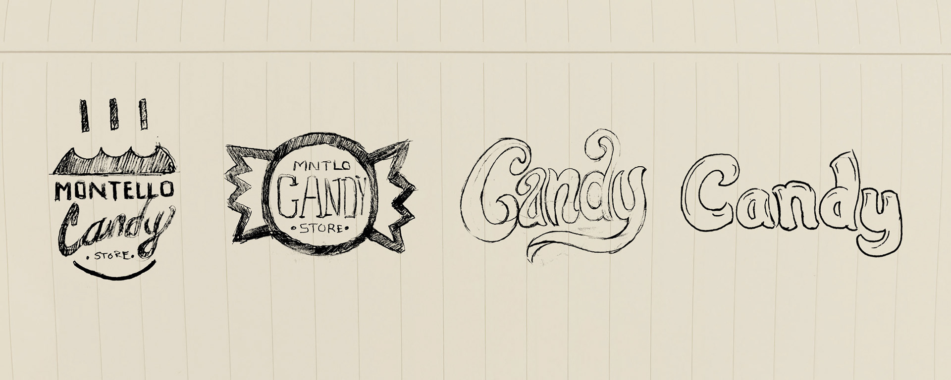
Concept
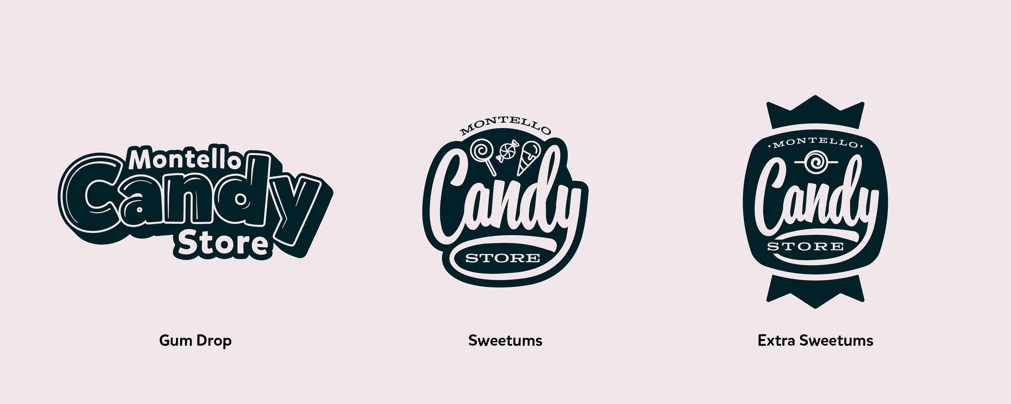
Gum Drop
A playful, kid-friendly approach that leans into the fun and whimsical nature of candy itself. Bubbly, hand-drawn letterforms reminiscent of soft, chewy treats. An approachable, friendly aesthetic that appeals to families and children.
Sweetums
For a more vintage-inspired look, this concept draws from classic candy packaging and storefront signage of the past. Typography influenced by old-fashioned sweet shops, with a balance of elegance and fun. Extra Sweetums features a unique vertical orientation, shaped like a wrapped hard candy with twisted ends. A bold, standout presence, making it perfect for signage, packaging, and merchandise.
Concept Refinement
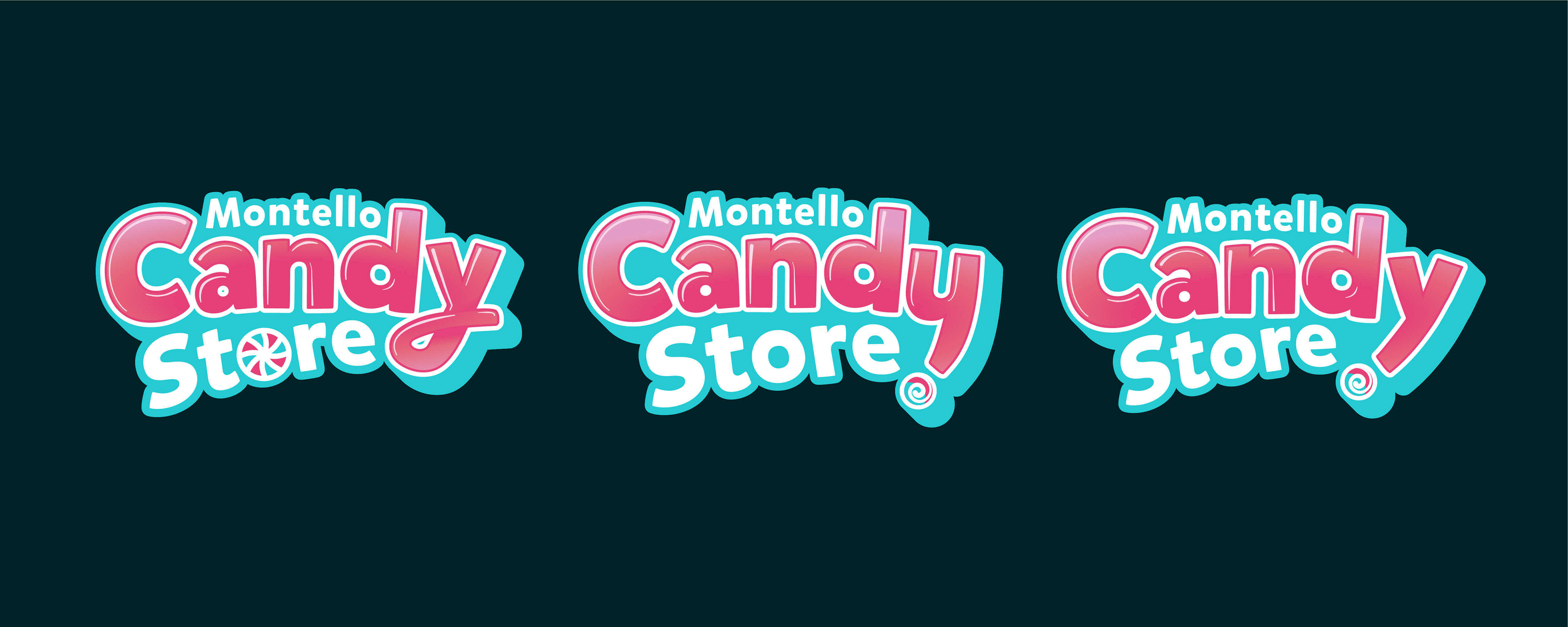
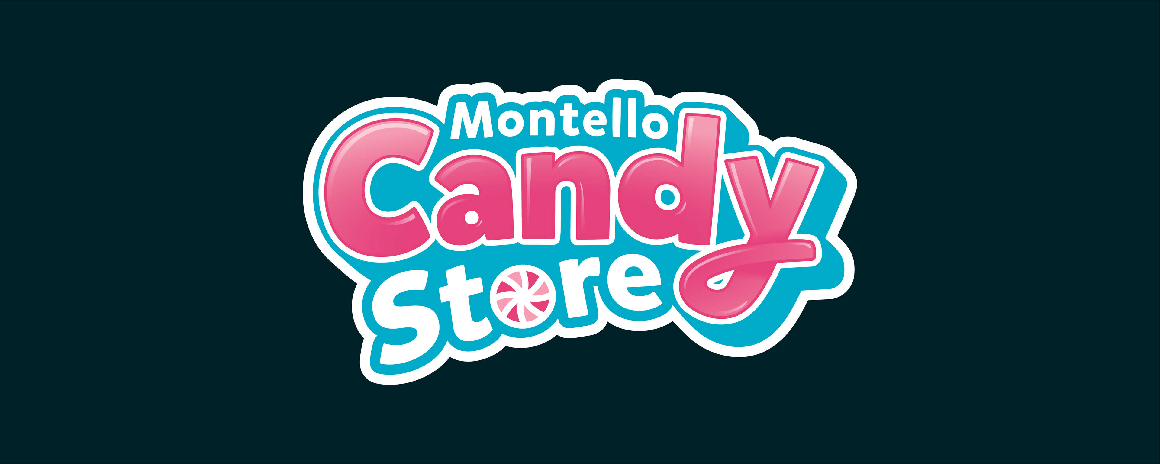
Selected Identity
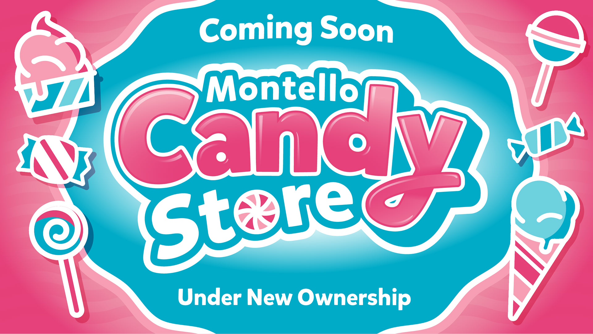
The rebrand successfully blends history with modern energy, ensuring the candy store remains a beloved local landmark while becoming an irresistible stop for visitors. With its versatile application, the new logo works beautifully across signage, packaging, and digital branding—making The Candy Store a destination as sweet as its treats.
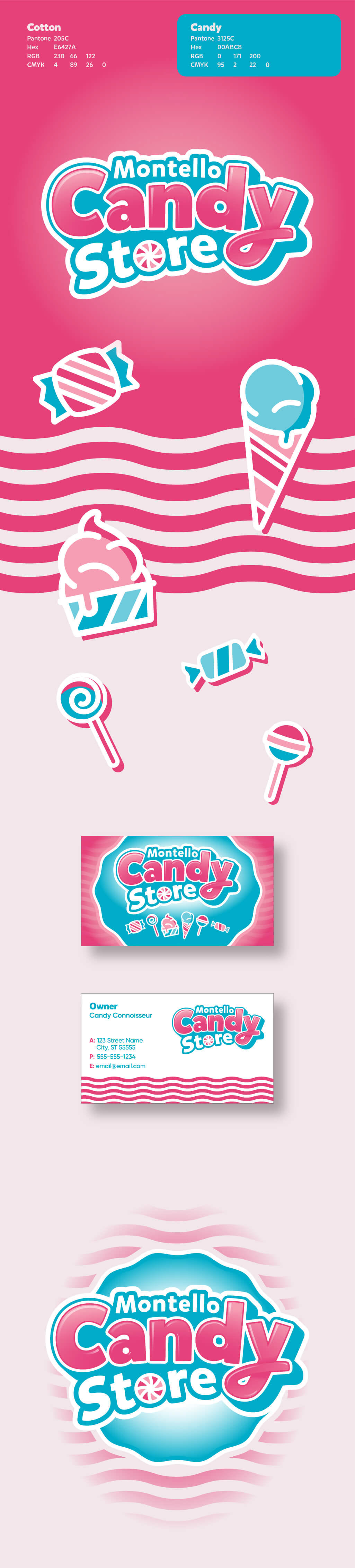
color palette
The palette for this project was inspired by cotton candy—a staple of every youngsters childhood. A soft yet vibrant teal was also chosen to reflect the hand-painted lettering on the store’s exterior windows, ensuring a seamless connection between the brand and its physical space and saving some cost to the small business. Pops of bright, sugary hues create a sense of excitement and playfulness while maintaining a cohesive, nostalgic feel.