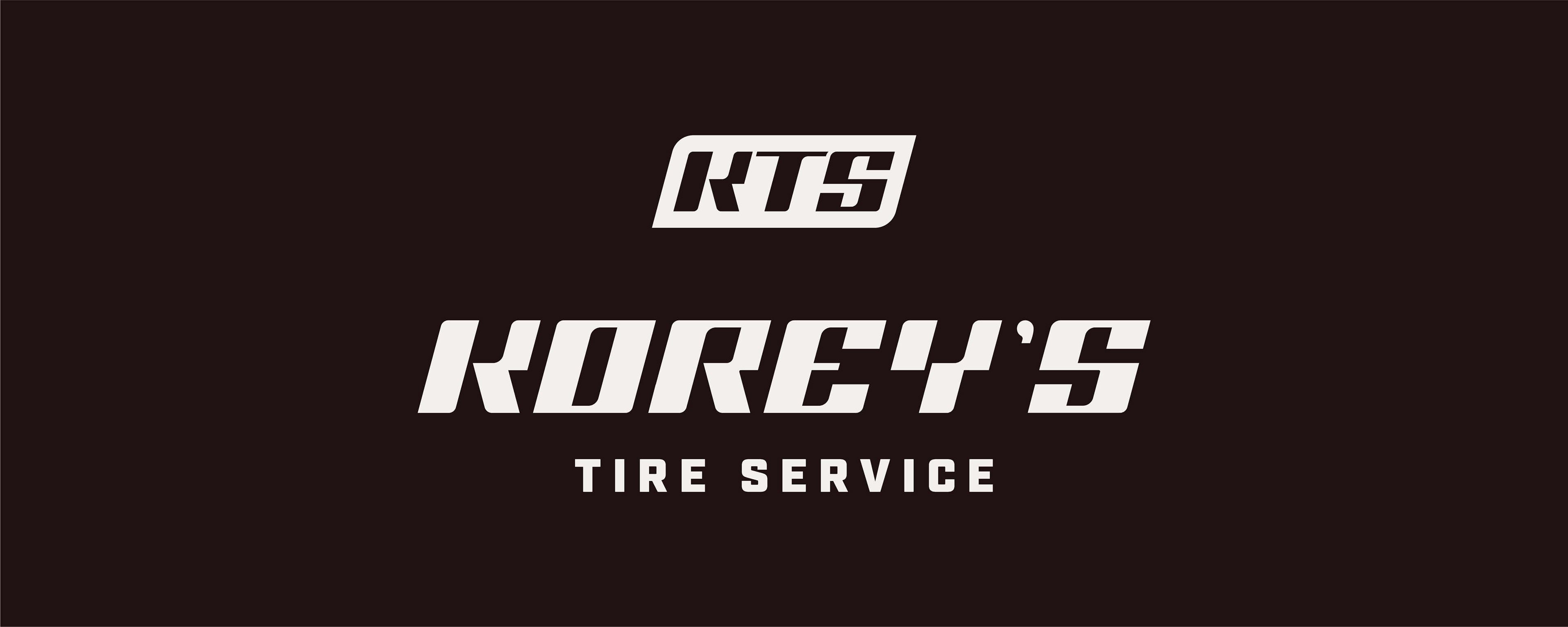
Korey's Tire Service, located in Montello, WI, specializes in agricultural and commercial tire service. The client sought a logo that stood out from the competition—bold, eye-catching, and impactful on apparel and vehicle branding. To enhance flexibility, they required two versions: a full logo featuring "Korey's Tire Service" and an abbreviated "KTS" version.
Concept & Design Strategy

Identity refinement
The Korey’s Tire Service brand identity captures the energy and reliability of the company’s services while offering a modern, versatile visual system. The combination of bold typography, structured color application, and unique graphic elements ensures high recognition and seamless adaptability across various platforms and materials.
This cohesive branding system positions Korey’s Tire Service as a leader in agricultural and commercial tire service, delivering both function and style.
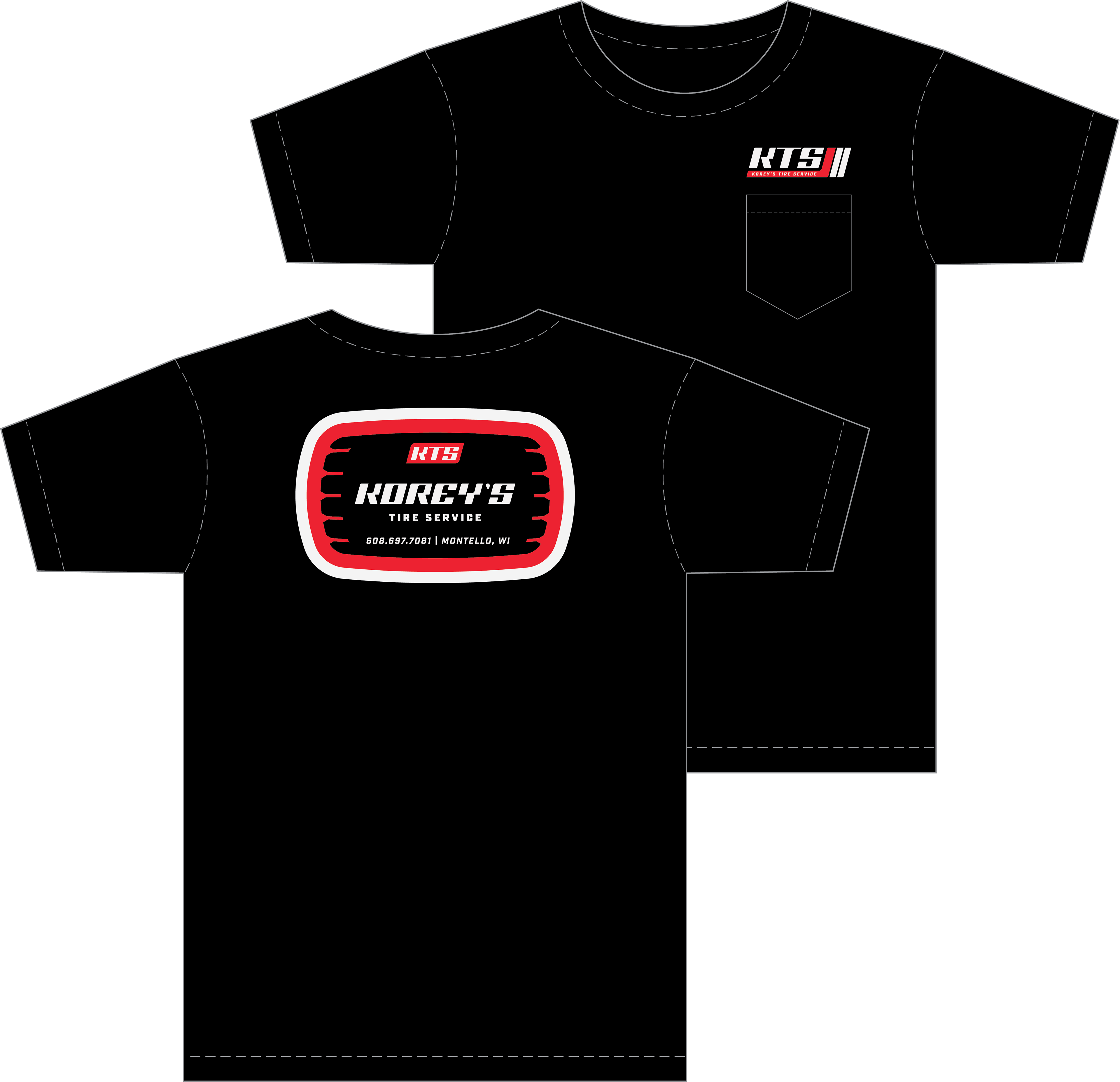
The logo system was developed with modularity in mind, allowing for seamless use in various applications. The primary word mark and KTS icon work independently or in combination to maximize brand recognition and consistency.
This cohesive branding system positions Korey’s Tire Service as a leader in agricultural and commercial tire service, delivering both function and style.
The logo system was developed with modularity in mind, allowing for seamless use in various applications. The primary word mark and KTS icon work independently or in combination to maximize brand recognition and consistency.
Word mark
Korey’s Tire Service logo features custom automotive-inspired letterforms that emphasize speed and authenticity. The thick, bold typography is reminiscent of aggressive tire tread, reinforcing the brand’s rugged reliability. The KTS abbreviation is a compact, powerful mark designed for versatility. This version maintains the strong letterforms of the full word mark, ensuring brand cohesion across different applications such as uniforms, vehicles, and promotional materials.
The secondary typeface featured is the font Industry - ultra-bold. A geometric typeface with aggressive kerning, enhancing readability and conveying confidence.
The secondary typeface featured is the font Industry - ultra-bold. A geometric typeface with aggressive kerning, enhancing readability and conveying confidence.
color palette
KTS’s brand colors balance boldness with discipline. The color palette was designed for high visibility, strong contrast, and adaptability across multiple applications.
Burning Rubber Red – A dominant, high-energy hue symbolizing action and reliability.
Pozi-Black – A deep black for strength and clarity.
White-Wall – A warm off-white for a classic, clean look.
Lug Nut Blue – An accent color used strategically for a playful yet professional pop.
Pozi-Black – A deep black for strength and clarity.
White-Wall – A warm off-white for a classic, clean look.
Lug Nut Blue – An accent color used strategically for a playful yet professional pop.
For brand consistency, the word mark is strictly presented in Pozi-Black and White-Wall. The badge container incorporates Burning Rubber Red, Pozi-Black, or Lug Nut Blue, with blue reserved for high-contrast situations.
Check out how I further developed Korey's Tire Service's identity into a cohesive brand.