

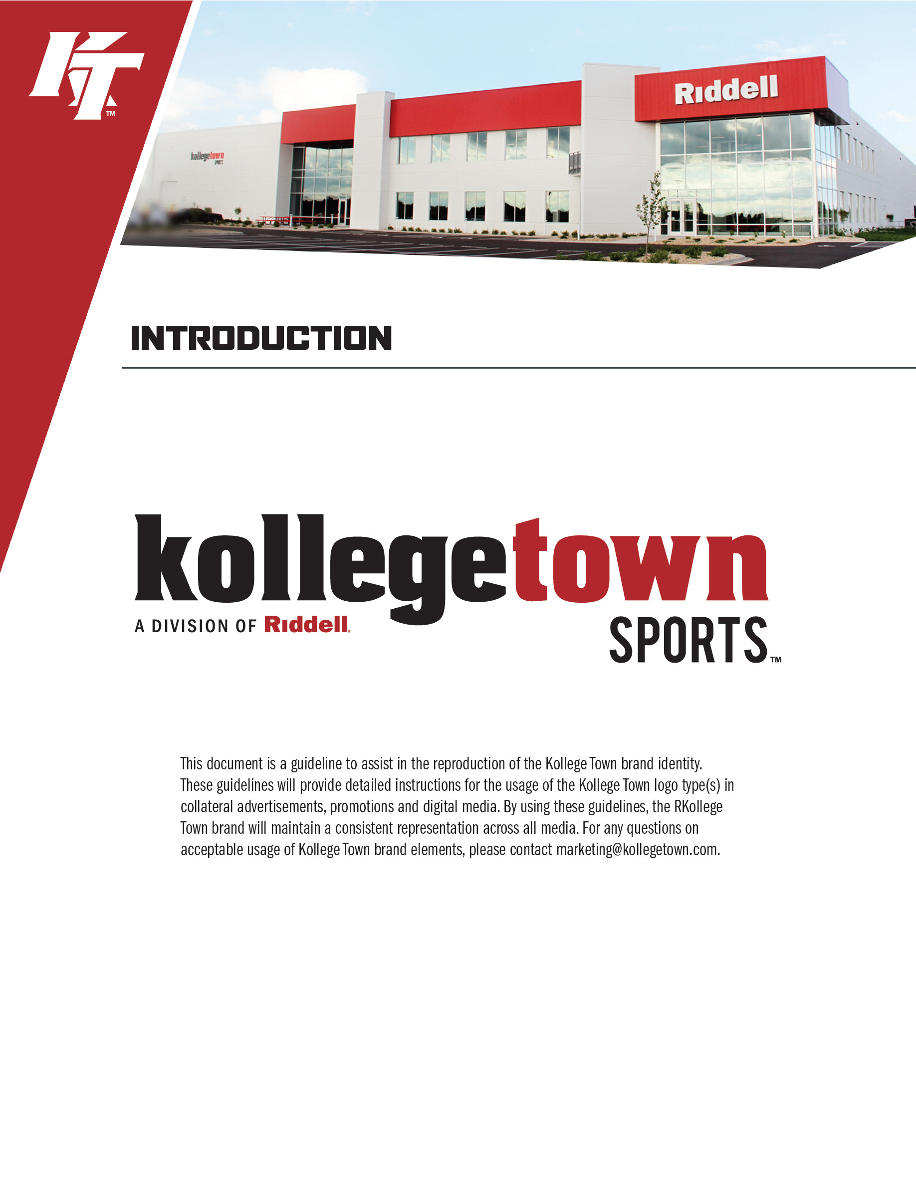
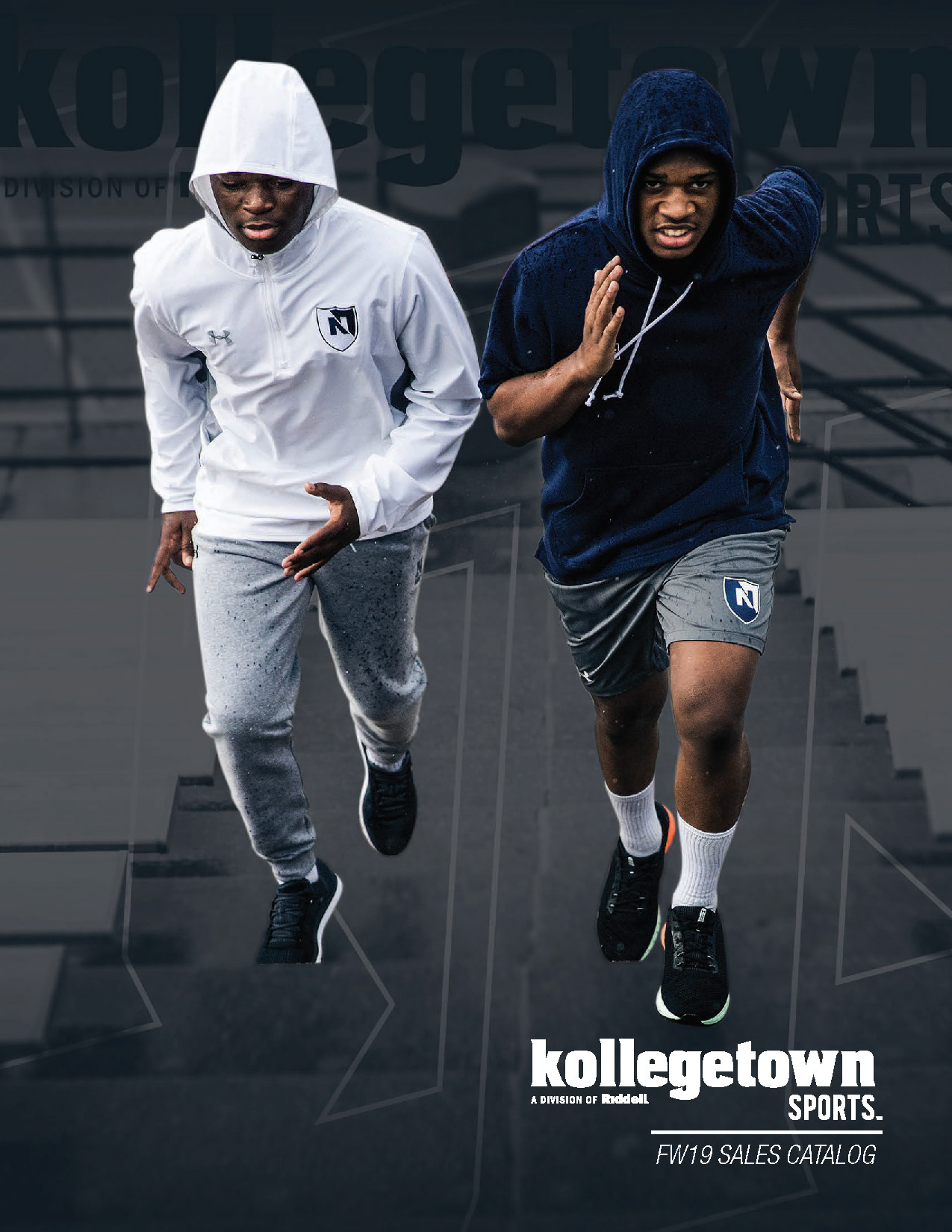
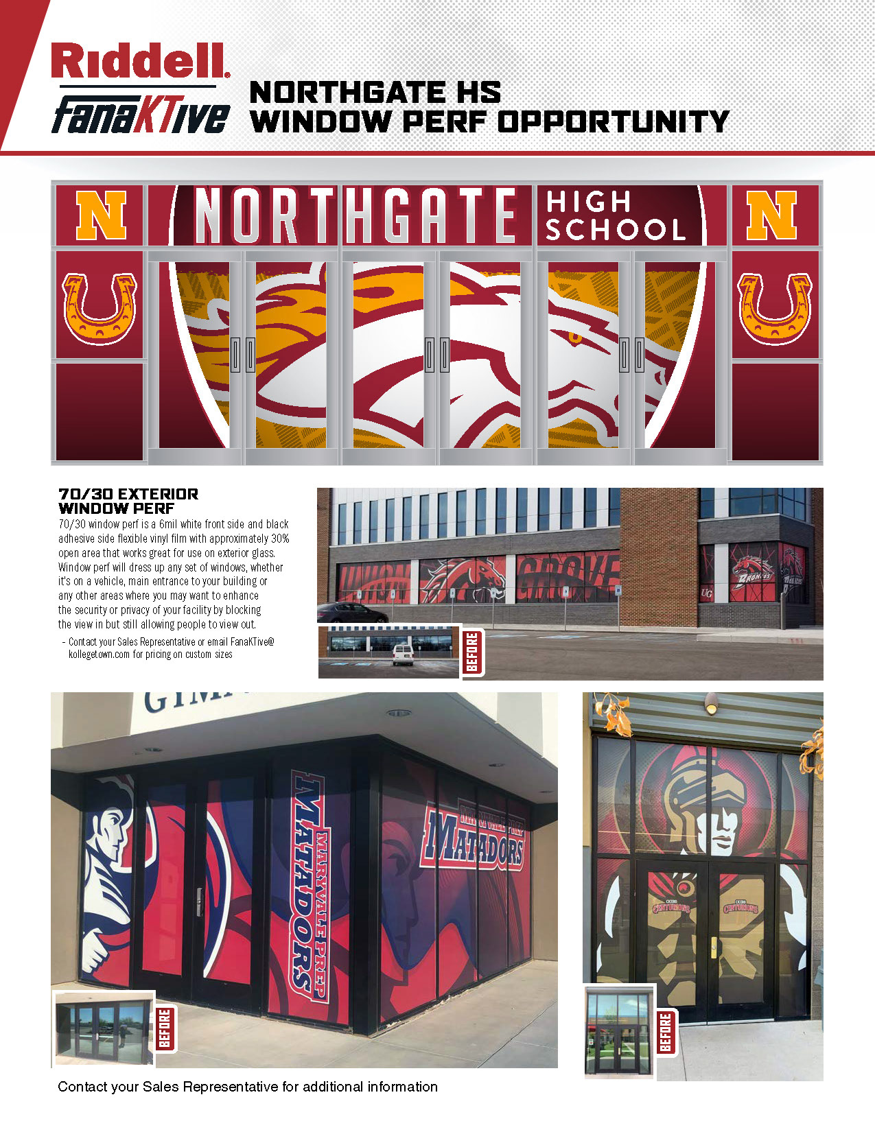
When I began working at Kollege Town their company visuals were a bit sporadic in style and execution. I wanted to create a design element that could span all of their marketing materials. After a quick study of their assets I determined the skew of the KT logo was interesting and could be a recognizable anchoring point.


I created a simple triangle element that would work as a frame for all their representative assets.

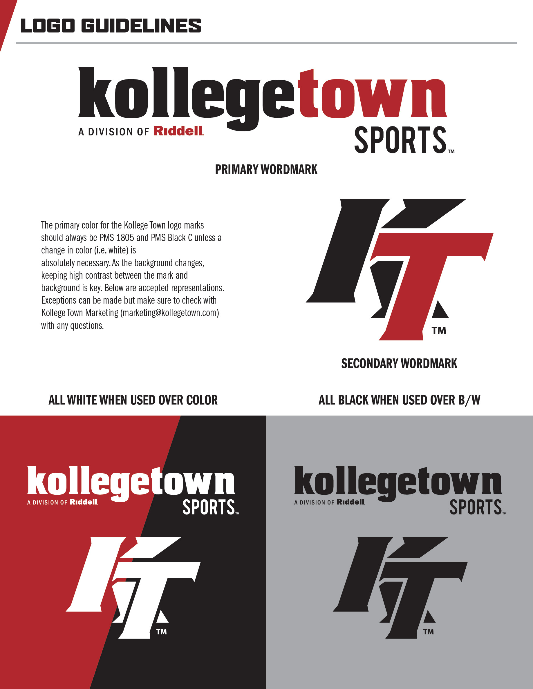
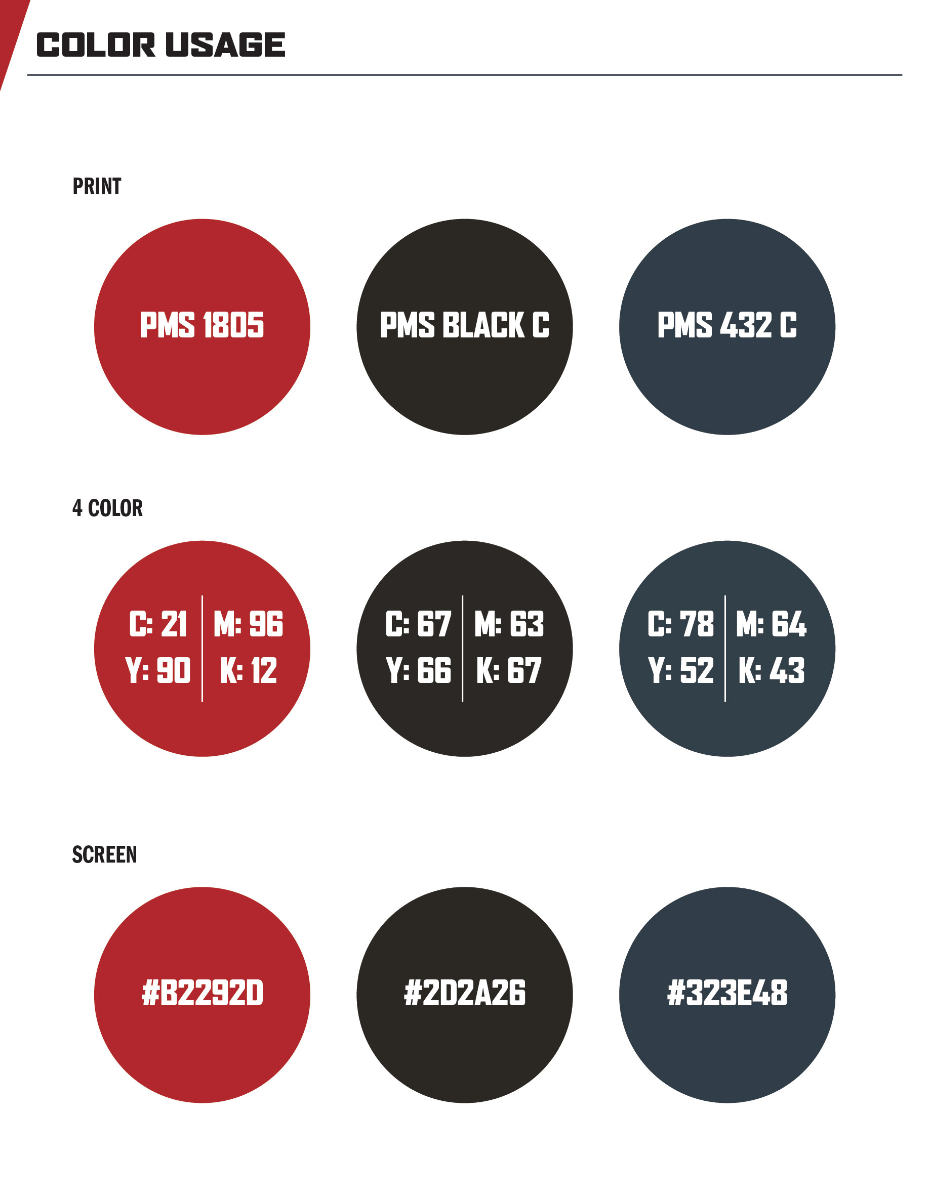
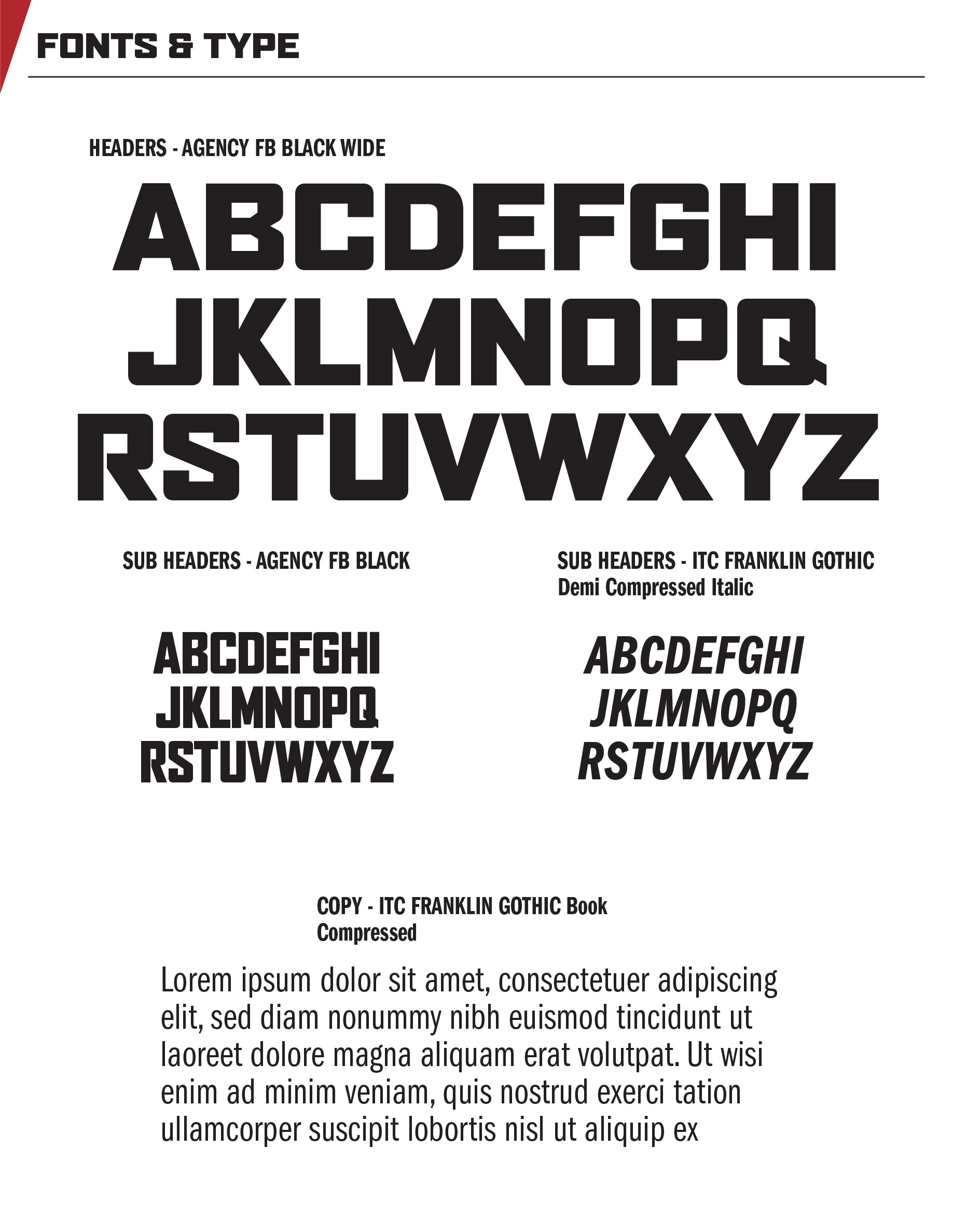
I developed a brand guide to ensure consistent logo and color usage.
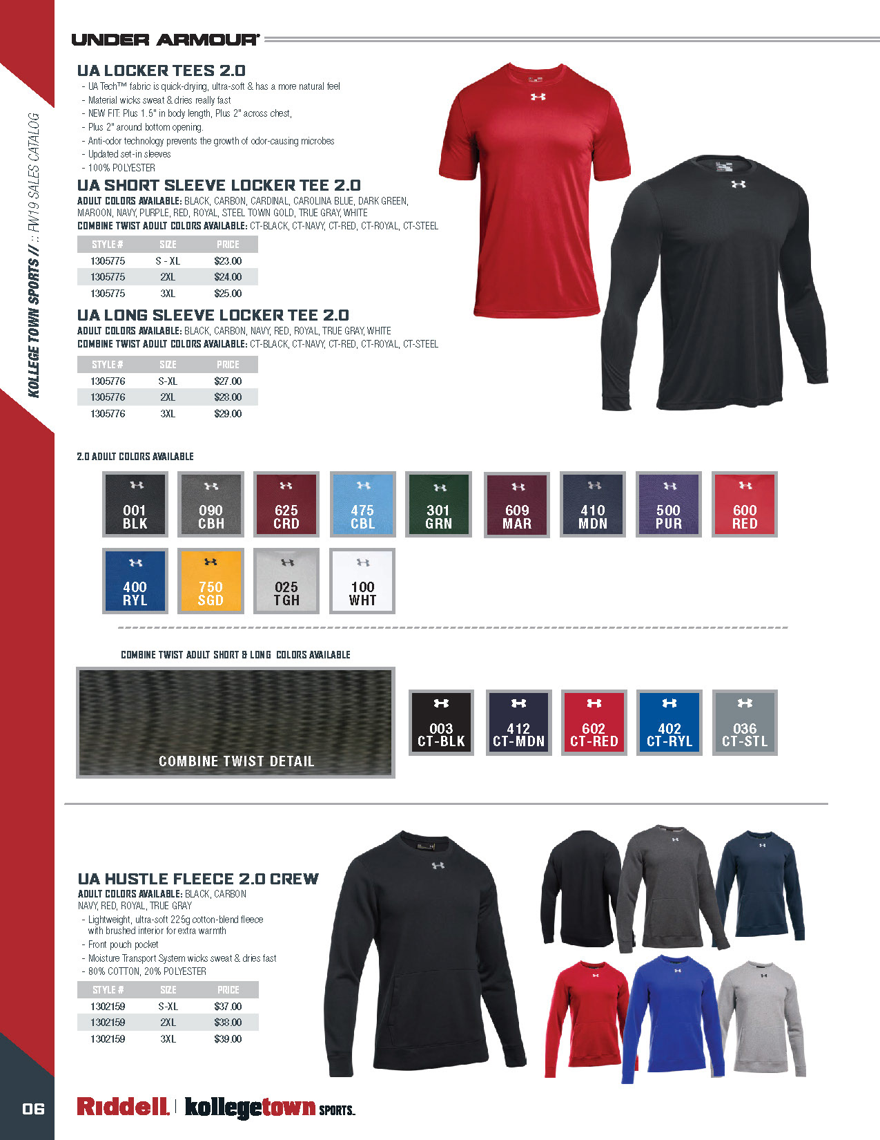
Created product catalog and flyer templates with defined master pages, paragraph, character and graphic styles

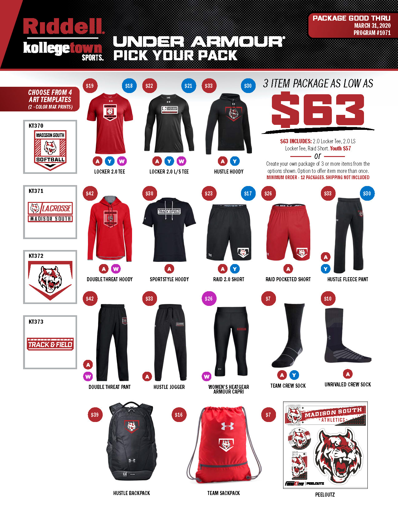
Flyer templates all are different yet feel cohesive. The apparel flyers are 2 different product channels. Visually they had to be different enough that a Sales Rep could at a glance know the difference in product and program.
Click the image for more information
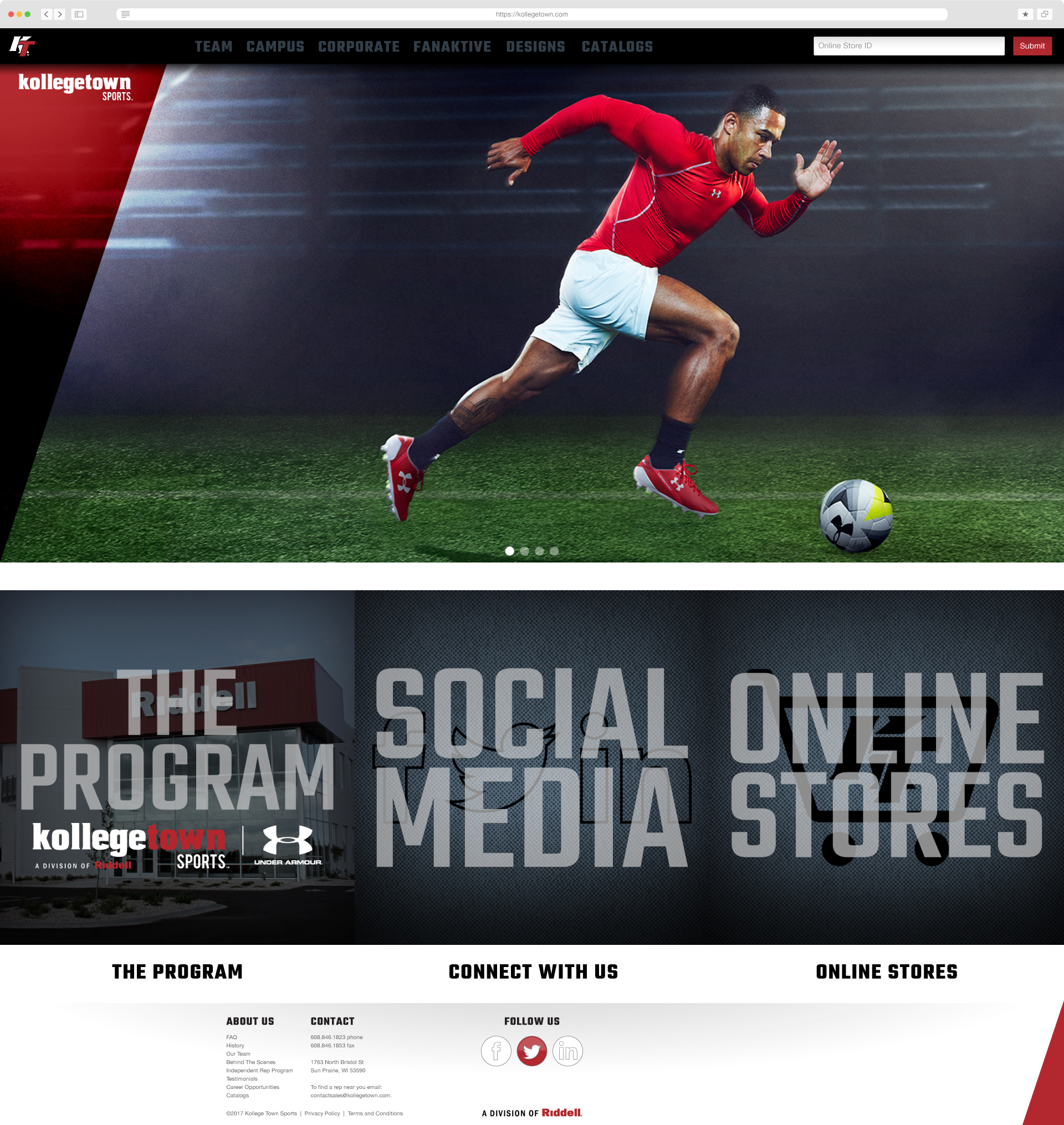
Redesigned the Kollege Town web site from the ground up. Needed to be more modern in framework, design and experience. I wanted large images with consistent effects & styles applied, pops of color & a strong grid. To give the new site a personal touch, I had all the sales reps submit their proudest jobs so we could showcase our own customers on the respective category pages.