Art Direction, design
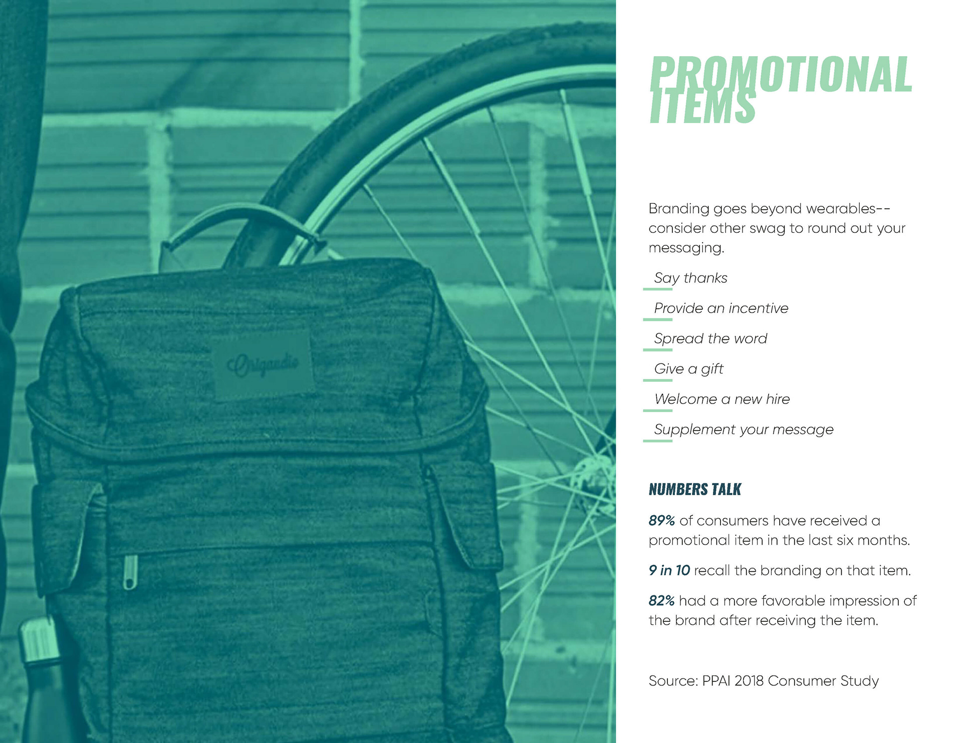
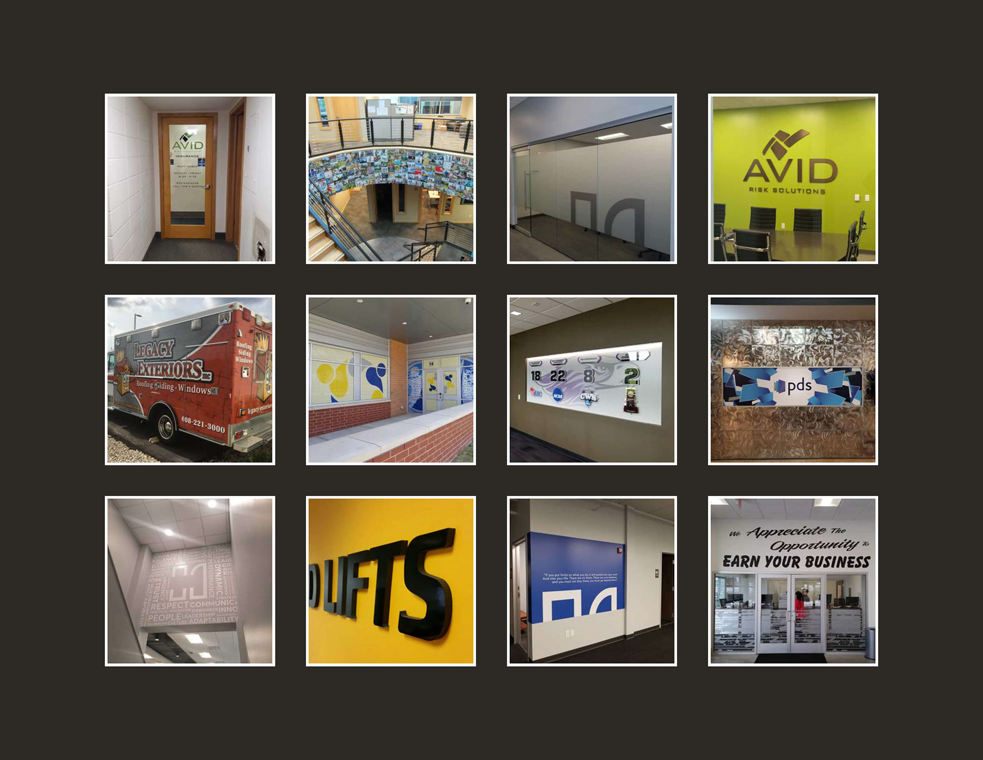
The Corporate Sales group needed a new catalog that briefly illustrated all of Kollege Towns capabilities, that wasn't sports related. I wanted it to give it a completely different look and color scheme then what we were doing on the sports side of the business. I chose a horizontal page orientation to really set it apart from our other marketing materials. The color green represents growth, I selected a trendy turquoise and black. Wanted to focus on large images that would evoke a personal response. Simple text and grid structure that pulls you through the pages. For the pages with multiple products I chose to frame them in a square grid. The equal frame size and padding creates balance, allowing each image to stand out on its own.
